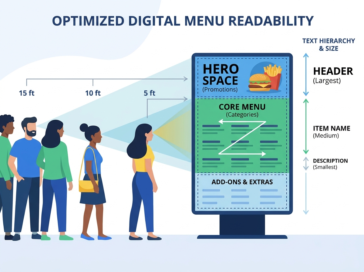
A slow-moving queue directly impacts restaurant revenue. Customers struggle when they cannot read menus from the back of a line. They delay their decisions until reaching the register. This hesitation increases order time and reduces total throughput. You must face a harsh reality. High-resolution screens and aesthetic designs remain completely useless if typography fails. Real-world environments feature high glare and distracting ambient lighting. We designed this guide to solve these exact friction points.
Our technical and psychological framework helps you build an optimal layout. You will learn to drive faster decision-making and reduce customer anxiety. Strategic legibility ultimately increases your average ticket size. We will explore optimal screen distances, visual layout grids, and hardware standards. Your restaurant can serve more customers quickly when you optimize your visual displays. Clear menus eliminate confusion at the counter. A streamlined ordering process keeps your staff working efficiently. Every second saved translates directly into higher daily sales.
Key Takeaways
- Queue friction is often a design problem, not a staffing problem; optimizing readability reduces time-at-register.
- Accurate calculation of menu screen viewing distance dictates hardware placement and typography choices.
- A structured digital menu layout grid prevents visual fatigue and guides the customer’s eye to high-margin items.
- Commercial-grade hardware is required to maintain contrast and legibility over long operational hours.
The Business Cost of Ignoring Menu Screen Viewing Distance
Many operators prioritize aesthetic design over operational throughput. Illegible screens create a phenomenon known as "register hesitation." A customer waits in line for five minutes. They step up to the counter. Only then do they actually start reading the options. This hesitation adds crucial seconds to every single transaction. You measure success by reducing customer ordering time. Industry experts refer to this metric as the Speed of Service.
Environmental factors actively fight against your screens daily. Ambient light from overhead fixtures washes out colors. Poor window placement introduces harsh reflections during peak afternoon hours. Horizontal and vertical viewing angles distort clarity. Customers standing off-center struggle to read the text. The physical layout of your lobby complicates this further.
You must evaluate your space accurately. We evaluate spaces using the menu screen viewing distance as a baseline metric. Standard industry metrics indicate customers begin scanning menus from 10 to 15 feet away. Your setup succeeds only when a customer at the back of a five-person line reads comfortably. They should easily spot primary categories and featured items. No one should ever have to squint or lean forward. Good legibility directly increases your daily transaction volume. Designing for distance eliminates the most common bottleneck in fast-casual dining.
Calculating Restaurant Screen Font Size for Queue Legibility
Digital signage experts rely heavily on the proven 10-to-1 rule. You need one inch of physical text height for every 10 feet of viewing distance. This metric guarantees text remains clear from the back of the queue. You cannot guess these measurements. You must calculate them precisely for your specific lobby dimensions.
Careful typography selection matters immensely. We strongly recommend sans-serif fonts for commercial displays. Fonts like Helvetica, Roboto, or Open Sans work best. These fonts maintain a uniform stroke width. Uniform lines prevent pixel blurring at a distance. Avoid script, heavily stylized, or ultra-thin fonts entirely. Delicate typography degrades rapidly under harsh overhead restaurant lighting. Thin lines disappear when viewed from more than five feet away.
You must establish a strict visual hierarchy. A structured restaurant screen font size framework looks like this:
- Category Headers: Make items like "Burgers" or "Salads" the largest and boldest. They must remain highly readable from 15 or more feet away.
- Item Names: Use a medium weight for individual dishes. Customers should read these clearly from 10 feet.
- Descriptions and Calories: Keep these the smallest. Design them specifically for the final 3 to 5 feet of the queue.
Contrast drives legibility just as much as physical size. High contrast compensates for smaller text effectively. Stark white text on a dark charcoal background performs exceptionally well. Low-contrast pastel combinations wash out easily. Maximize visual clarity to keep the line moving steadily. Always prioritize function over delicate artistic expression.
![Digital Menu Board Design and Layout Optimization]()
Structuring the Digital Menu Layout Grid for Quick Scanning
Human eyes scan digital displays using predictable, well-documented patterns. Viewers naturally follow a Z-pattern or an F-pattern when reading screens. The top-left corner serves as your highest-value real estate. Customers look there first instinctively. You must place your most profitable items in this zone.
You must zone the screen logically to prevent confusion. A standardized digital menu layout grid prevents visual fatigue. We break the screen down into three primary reading zones.
Screen Zoning Strategy for Maximum Conversion | Zone Location | Zone Purpose | Content Focus |
| Zone 1 (Hero Space) | Visual anchors and promotions | High-margin items, limited-time offers, vivid food photography. |
| Zone 2 (Core Menu) | Logical categorization | Main meals, sides, drinks arranged by clear headers. |
| Zone 3 (Add-ons) | Low-friction upsells | Desserts, extra toppings placed near the end of the reading path. |
Embrace negative space to improve overall readability. A common implementation mistake involves cramming too many items onto one screen. You should cap item counts per screen strictly. Use negative space to create natural visual breaks. The human brain needs room to process information quickly. Cluttered screens cause anxiety and decision paralysis.
We also warn against the risks of over-animating your menus. Motion should draw attention to a specific promotion only. It should never distract from the core reading experience. Avoid these common animation mistakes:
- Using constantly flashing text for prices.
- Deploying spinning graphics next to menu categories.
- Transitioning full screens too rapidly while customers read.
Keep animations subtle and intentional. A gentle steam effect on a coffee cup works beautifully. Hectic transitions will only frustrate your waiting customers.
Optimizing Food Price Display Readability and Conversion
Pricing strategy extends far beyond the actual number on the screen. You must de-emphasize the currency itself. Removing the dollar sign serves as a powerful psychological tactic. This subtle change reduces the "pain of paying" for the customer. It keeps the number easily scannable. A simple "5.99" feels less intimidating than "$5.99."
Alignment strategies also impact ordering behavior significantly. We advise strongly against using "leader dots." These dots look like this: Burger ........ 5.99. Strict price columns encourage pure price-shopping. Customers compare numbers instead of reading your delicious food descriptions. You should nestle the food price display readability naturally at the end of the item description. Make the price blend in.
Highlight value instead of highlighting the exact cost. Use subtle visual cues strategically. Draw simple boxes around combo meals. Use contrasting background colors to highlight bundled offers. Frame them as cohesive, valuable packages rather than standalone expensive items. Customers respond better to perceived value.
Well-structured price layouts offer another major operational benefit. They allow for seamless dynamic pricing integration. You can deploy real-time updates via a content management system (CMS). Your layout grid remains completely unbroken when prices change. You can switch effortlessly from a breakfast menu to a lunch menu. Dynamic pricing helps you maximize revenue during peak operating hours.
Hardware Validation: Deploying a Reliable Digital Menu Board
Cutting corners on display hardware introduces severe operational risks. Many owners try using consumer TVs to save money initially. Consumer hardware fails rapidly in demanding restaurant environments. Commercial kitchens generate intense grease, smoke, and heat. Airborne particles infiltrate standard television vents easily. Consumer TVs cannot survive 16/7 or 24/7 runtimes safely. They suffer from image burn-in, color degradation, and premature component failure. You absolutely need true commercial-grade equipment.
Brightness matters just as much as physical durability. The display industry measures brightness in units called "nits." We recommend a minimum of 400 to 500 nits for a standard indoor digital menu board. Window-facing displays or drive-thru scenarios require 2500+ nits. High brightness prevents direct sunlight glare from obscuring your text. Screens appearing dark or washed out will frustrate your customers instantly.
Panel finish also affects readability dramatically. We recommend anti-glare, matte commercial panels exclusively. Glossy screens act like mirrors in brightly lit lobbies. Matte screens diffuse harsh overhead restaurant lighting beautifully. They preserve text clarity from any viewing angle.
Finally, you must meet essential software prerequisites. A robust setup requires modern cloud-based CMS software. You need to push content updates across multiple screens seamlessly. Relying on manual USB drives creates unnecessary operational bottlenecks. USB drives get lost, corrupted, or left outdated. Cloud systems let you update menus from anywhere.
Conclusion
Readability directly correlates with your daily revenue generation. Fast decision-making relies entirely on clear typography and logical layouts. Illegible screens slow down lines and cost you money. You must apply a final polish before launching any new system.
We highly recommend following a strict evaluation checklist. Before finalizing your rollout, test the layout on a physical screen. Do not rely solely on computer monitors. Mount the test screen at the exact planned height. View it carefully from the intended customer distance.
Take actionable next steps immediately to improve your restaurant. Audit your current queue times during peak lunch hours. Measure your wall-to-queue distance accurately with a tape measure. Shortlist commercial-grade display vendors and reliable CMS providers. Better legibility ensures shorter lines, happier customers, and higher profits.
FAQ
Q: Do I need special software, or can I just use a regular flat screen with a USB?
A: You need a commercial-grade cloud Content Management System (CMS). Relying on USB drives creates major operational bottlenecks. Manual updates consume staff time and introduce security risks. A cloud CMS allows you to update prices, remove sold-out items, and schedule promotions instantly across all screens from one central dashboard.
Q: How does a drive-thru menu board differ from an indoor one?
A: Drive-thru boards require extreme weatherproofing against rain, heat, and freezing temperatures. They need ultra-high brightness exceeding 2500 nits to combat direct sunlight. Layouts are significantly simplified to ensure faster vehicle throughput. Indoor boards focus more on aesthetic branding and operate at lower brightness levels.
Q: Are pre-made digital menu templates effective?
A: Pre-made templates provide a solid starting point for new operators. However, they are rarely perfect out of the box. You must customize them to match your specific queue distances. Adjust the layout grids, tweak font sizes, and incorporate negative space to guarantee maximum legibility for your unique environment.
Q: Should I use dark mode or light mode for my menu screens?
A: Dark backgrounds featuring light text generally perform better in restaurants. This "dark mode" approach significantly reduces screen glare. It lowers eye strain for customers reading from a distance. Bright white backgrounds often reflect overhead lighting too intensely, making the text harder to read quickly.